


MSC Divina
MSC Cruises
Get FREE email communications from Fodor's Travel, covering must-see travel destinations, expert trip planning advice, and travel inspiration to fuel your passion.


With something for just about everyone, cruises cater to all kinds of travelers—rest assured, the perfect fit is just waiting for you, once you know just where (and how) to look. Once you’ve made your match and have properly planned and prepped, you’ll be ready to set sail, and you’ll be free to do as much or as little as you please on board. Off the ship, there’s always a new destination to explore just over the horizon. Sailing away on the ship of your dreams is more affordable—and enjoyable—than ever before, and this Cruising 101 guide is just the resource you need, whether you’re a first-timer or a seasoned cruise vet, to help you on your way.
Once you know you want to take a cruise, the choices you face can seem endless. Where to begin? By doing research and learning more about cruise travel, you’ll be able to make informed decisions and properly plan your trip—advance planning is the only true way to avoid disappointment and ensure that you spend your money and precious vacation time wisely. This Cruising 101 primer comes jam-packed with advice, tips, and strategies that will help you answer questions and make the right choices so that the cruise adventure you select will be stress-free, fun-filled, value-packed, and the very best fit to realize your idea cruise.
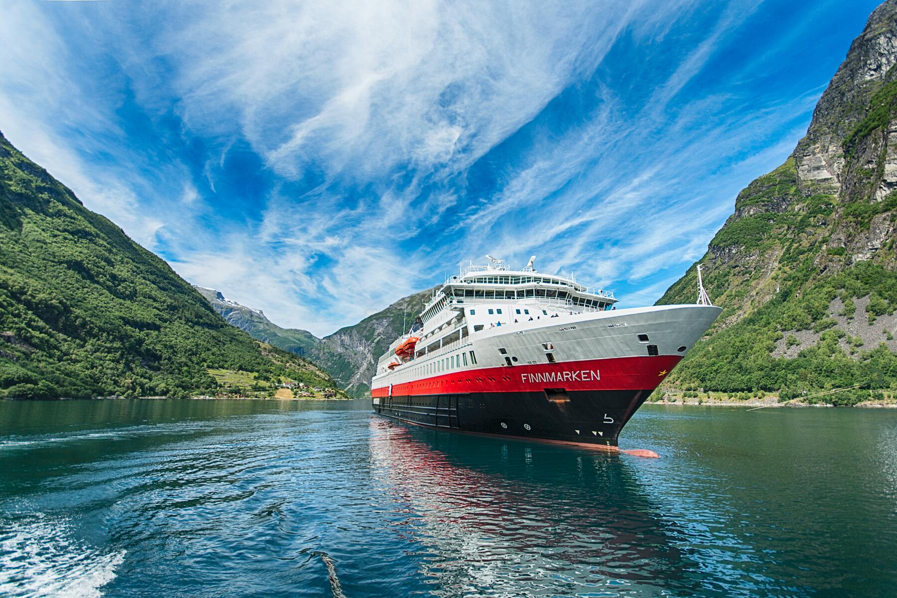
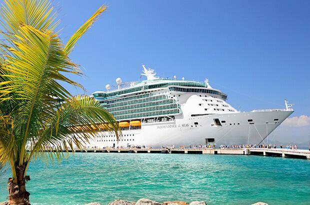
In cruising, one size definitely does not fit all. What’s appealing to one passenger may be unacceptable to another. The ship you pick will determine the type of accommodations you’ll have, what kind of food you’ll eat, what style of entertainment you’ll see, and even the destinations you’ll visit. If you don’t enjoy your ship, you probably won’t enjoy your cruise. The most important factors you’ll need to consider when booking a cruise are the size of the ship, the type of cruise line, and your cabin.
When planning for a cruise vacation, what do most potential passengers want to know? First and foremost, figuring out the costs associated with cruising is a biggie, like what’s included in the fares (and what’s not), and how to save money on bookings. Then there’s the decision of whether to go it alone and book your cruise online or to use a trusted travel agent to seal the deal. Finally, there are specific considerations for cruisers with special interests and lifestyles who are looking to pin down their perfect cruise vacation match.
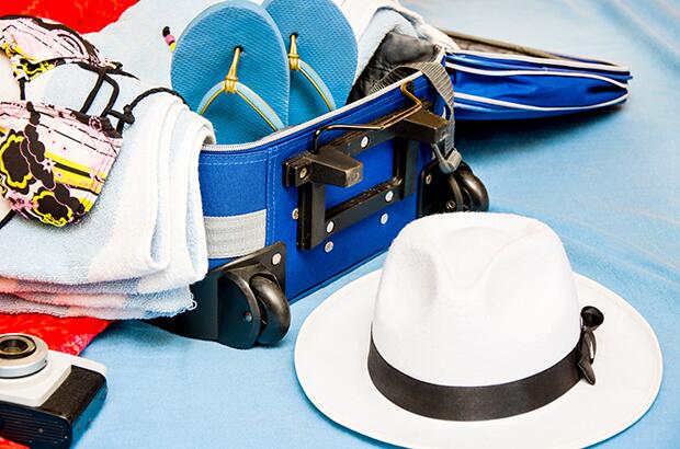
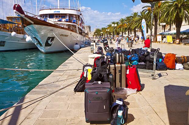
Some of the things you’ll need to do before your cruise take time—for instance, obtaining travel insurance and the proper documents; other details, like packing, may seem relatively simple, but can expand in significance if you leave them all for the last minute. You’ll sleep better if you plan ahead. By breaking your preparation down into manageable chunks, you’ll have plenty of time to get ready and won’t be frazzled as your cruise date approaches. It’s much easier to leave your worries behind on the dock when you plan with care.
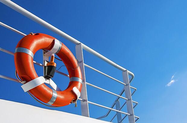
With the planning, packing, and anticipation behind you, finally embarking on your ship can be exhilarating—though it can also be slightly intimidating if you’re still learning the ropes. There will be a lot happening around you, and it will all be new. Not to fret: while procedures may differ slightly from cruise line to cruise line, once you understand the process and know what to expect, you can just go with the flow. After the check-in and boarding process is complete, the fun and relaxation really begin. Think of the ship as your first destination, a movable port of call, and keep in mind that most of today’s larger cruise ships have the same basic arrangements and share the same ultimate goal—for you to have a safe, enjoyable, and memorable vacation on board!


Have a cruising question? Ask our Fodorite community on the Cruises Forum.


